At Twilio, I was on a design systems team. We call that system Paste.
What’s Paste do?
Paste is a design system used to build accessible, cohesive, and high-quality customer experiences at Twilio.

The customers that rely on
Paste:
Internal:
front-end engineers
product designers
product managers
External:
End customers
plugin builders
vendors
On the Paste site there are patterns, primitives, token, and component documentation!
Why did we invest in this platform?
Insight 01
Twilio’s UX is inconsistent, leading to multiple teams spending hundreds of design & development hours to build the similar experiences
Insight 02
Twilio’s UX is cluttered and reduces efficiency in task completion.
Insight 03
Twilio’s UX is dull and doesn’t spark enthusiasm or pride from internal teams or customers alike.
It was going well, however,
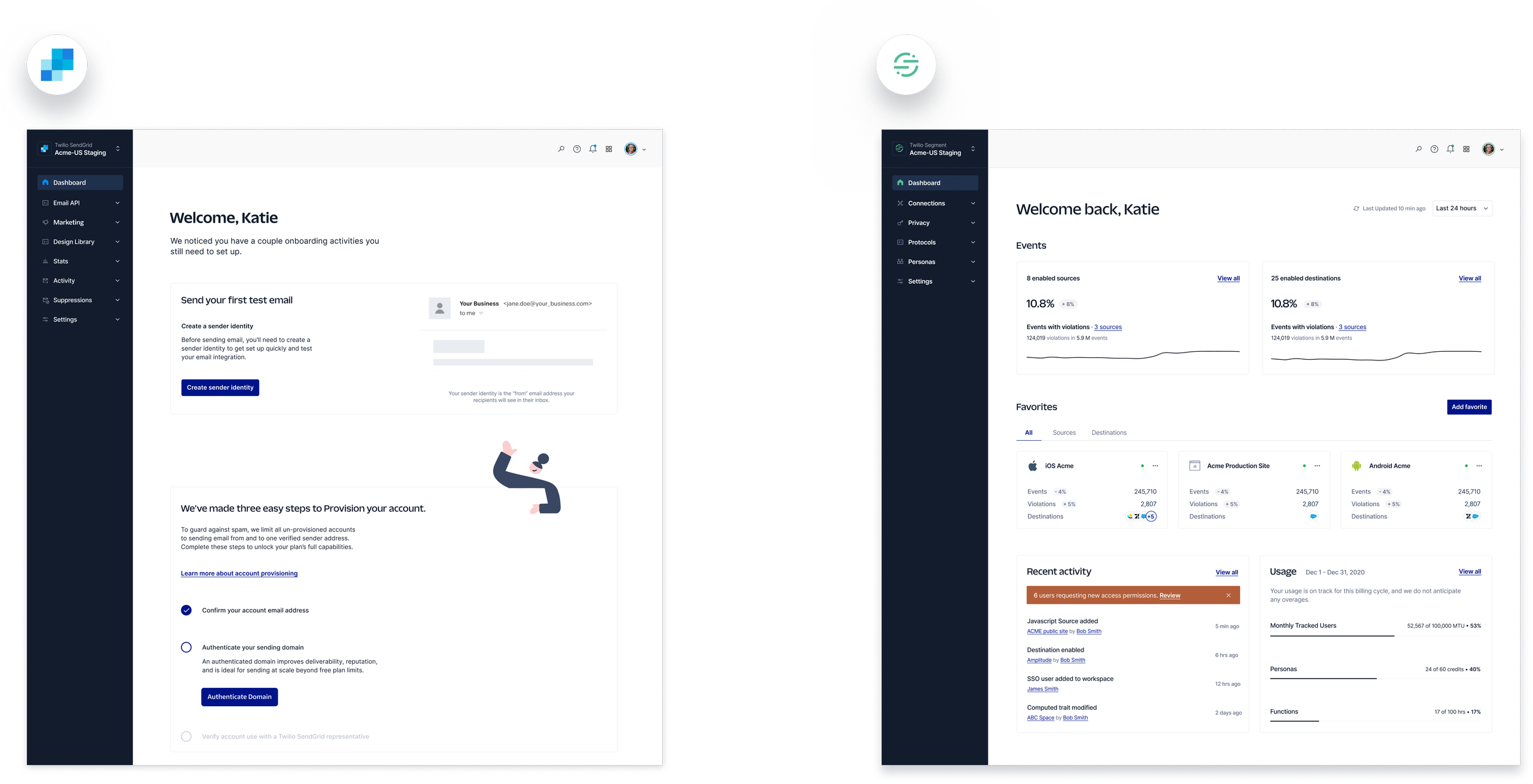
Twilio started acquiring new products. It became the wild wild west and there we’re tons of feelings…

Segment and SendGrid and Twilio had their own looks and feel within the product.

And our experience at Twilio became disjointed again. This is what our customers saw when they were onboarding.
We needed to evolve Twilio’s design language to enable a unified product experience.
Insight 01
Improve customer experience.
Like onboarding between Segment, SendGrid, and Twilio.
Insight 02
Increase reliability.
No team dedicated to Evergreen
Paste, fully staffed with a team of 15 and 80-90% code coverage.
Insight 03
Build for the future as One Twilio.
Accelerate product integration, smooth internal mobility, reduce and maintain lower levels of tech and design debt
Our key deliverables.
01
Design principles that influence the groundwork for “One Twilio”
02
Evolved Twilio product design foundations (typography, illustration, spacing) with high fidelity Figma mocks
03
Shared presentational components for topmast and sidebar to be used across all Twilio products
04
Rollout plan for Paste adoption in Segment Core, Engage, and SendGrid
We were on a mission to pave the way for a unified product experience by evolving the Twilio product design language.
Our team was writing the playbook for current and future Twilio products.

Methodology
We conducted this research via a survey, which allowed us to reach a wide breadth of ~50 customers across varying roles, product usage, and tenure. All respondents use at least two of the following products: Twilio Segment, Twilio SendGrid, Twilio Console, and/or Twilio Flex.
We shared product screenshots and asked customers questions around the visual design language and cohesiveness of the products. We also asked customers about cross-product workflows and what other product suites they use and what they think of them.
We conducted a baseline research analysis to see where we stood.
Goals
Understand how dis/satisfied customers are with the current design languages used across Segment, Console, Flex, and SendGrid and why.
Understand how cohesive customers believe Segment, Console, Flex, and SendGrid are and why.
Purpose
Use the visual design and cohesiveness scores as a baseline against which we will measure new design concepts in later phases of the project.
Pull out any insights about what we’re currently doing well and what needs improvement as we move into our design concepting phase.
Here’s how our customers rated the visual design of our products so far.
Overall, Segment had the highest star ratings for visual design, receiving 4.26 stars out of 5. Flex ranked second, with 4.06 stars out of 5. SendGrid ranked third, and Console fourth.

Themes that appeared in verbatim comments for what Segment does well were around hierarchy of pages (10 respondents), clear navigation (9 respondents), and clean layouts (5 respodents). Similar themes arose in Flex verbatims.
The Console and Flex screens were both using Paste, but ranked differently among respondents, indicating that customers are attuned to differences in implementation. Investing in strong implementation would likely have a big impact on the user experience.
Star ratings were lower among marketers, while they did not differ greatly when segmented by other role types, such as developers and executives.

We also wanted to see how well our products aligned to our desired traits we defined for this initiative.
In this closed word choice test, the top three terms used to describe Segment, SendGrid, and Flex were all in alignment with our product traits. Console was the only exception, with “practical” appearing as a trait in the top 3.
“Friendly” did not appear in the top 3 for any product, nor in the top 5. This aligns with the pattern that appeared in our likert scale questions, as well, so it should be a strong area of focus in our design language evolution.
“Friendly” appeared as the 6th highest ranked trait for Flex with 7 respondents selecting it, and the 7th highest trait for SendGrid with 7 respondents selecting it. 4 respondents described Segment as friendly, and 3 described Console as friendly.
How our customers rated our cohesion among Twilio products.

We took a deep dive into the market to provide us with strategic insights for our One Twilio groundwork.
We identified key players in the market and reviewed how they are building a cohesive product suite.
Insights we found for product suites.

Customers rely on shared UX patterns.
Design patterns reduce the learning curve by giving customers something they are familiar with. Customers don’t have to think too much about what the next steps are to move forward when they’re already familiar with a given interface. For example, Google has a consistent placement of applications on top right of the viewing screen to help customers feel confident to navigate within products.
Companies are expected to have a
cohesive personality across all digital platforms.
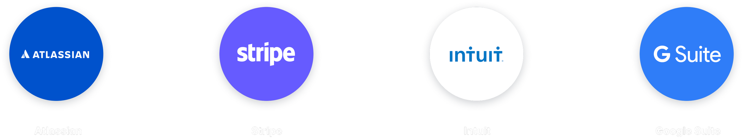
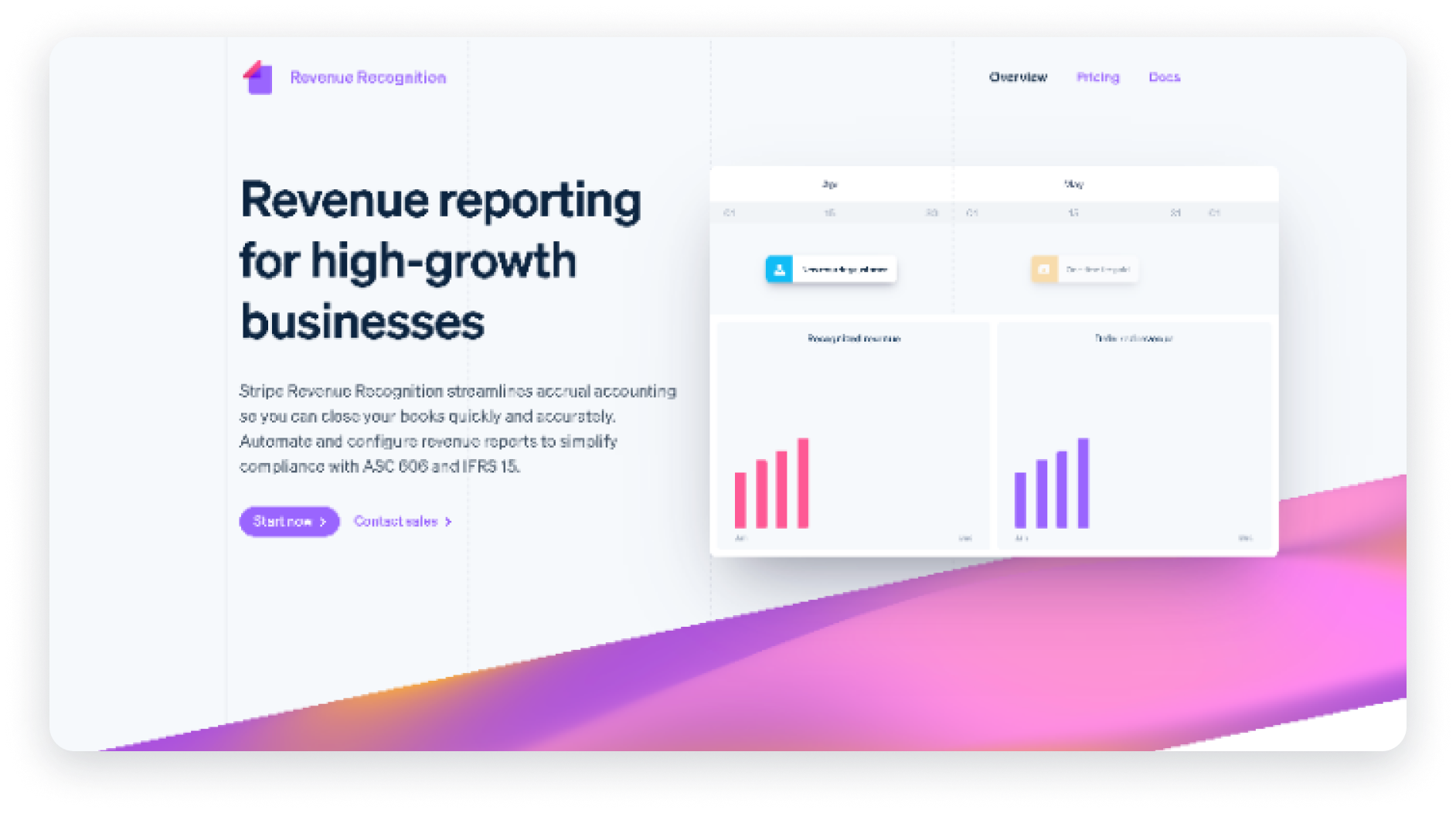
Companies like Stripe and Google have a consistent personality from their marketing landing pages to their product platforms. A consistent personality allows us to give customers a cohesive experience, throughout their entire journey.
Customers rely on strong integrations.
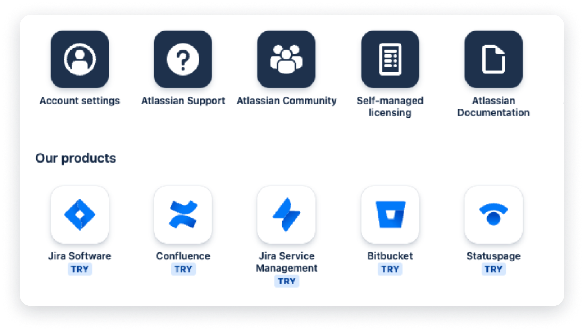
Atlassian is friendly and painless when switching through products. Once authenticated, Atlassian provides a home page where you can see all Atlassian products and helpful links.
We also needed to research key players in the customer engagement space.
Zendesk and Intercom take a modern approach to customer engagement.
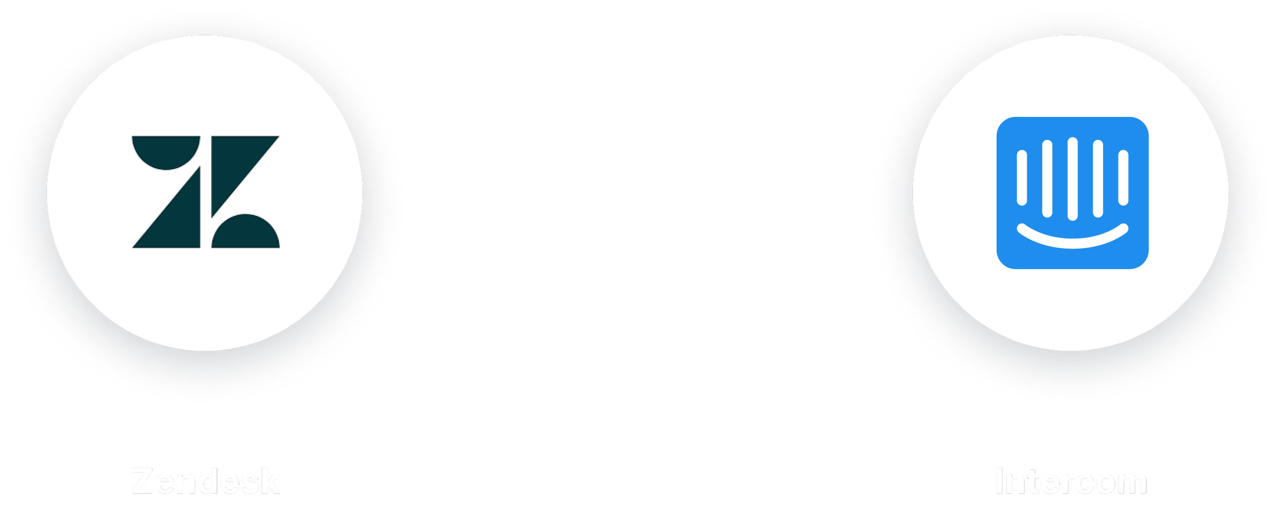
Insights for customer engagement products.
A friendly and approachable personality make customers feel comfortable.
Intercom and Zendesk invite customers in with their airy and approachable layouts. They hold their hand and guide customers with their strategic use of color for actions. In doing so, they are reassuring that they are there to support them every step of the way.

Agents are more efficient if they have all the tools they need in one viewport.
Agents no longer have to hop between screens, instead Zendesk gives one centralized dashboard that utilizes their left and right rails, so they have all the tools they need at their fingertips.

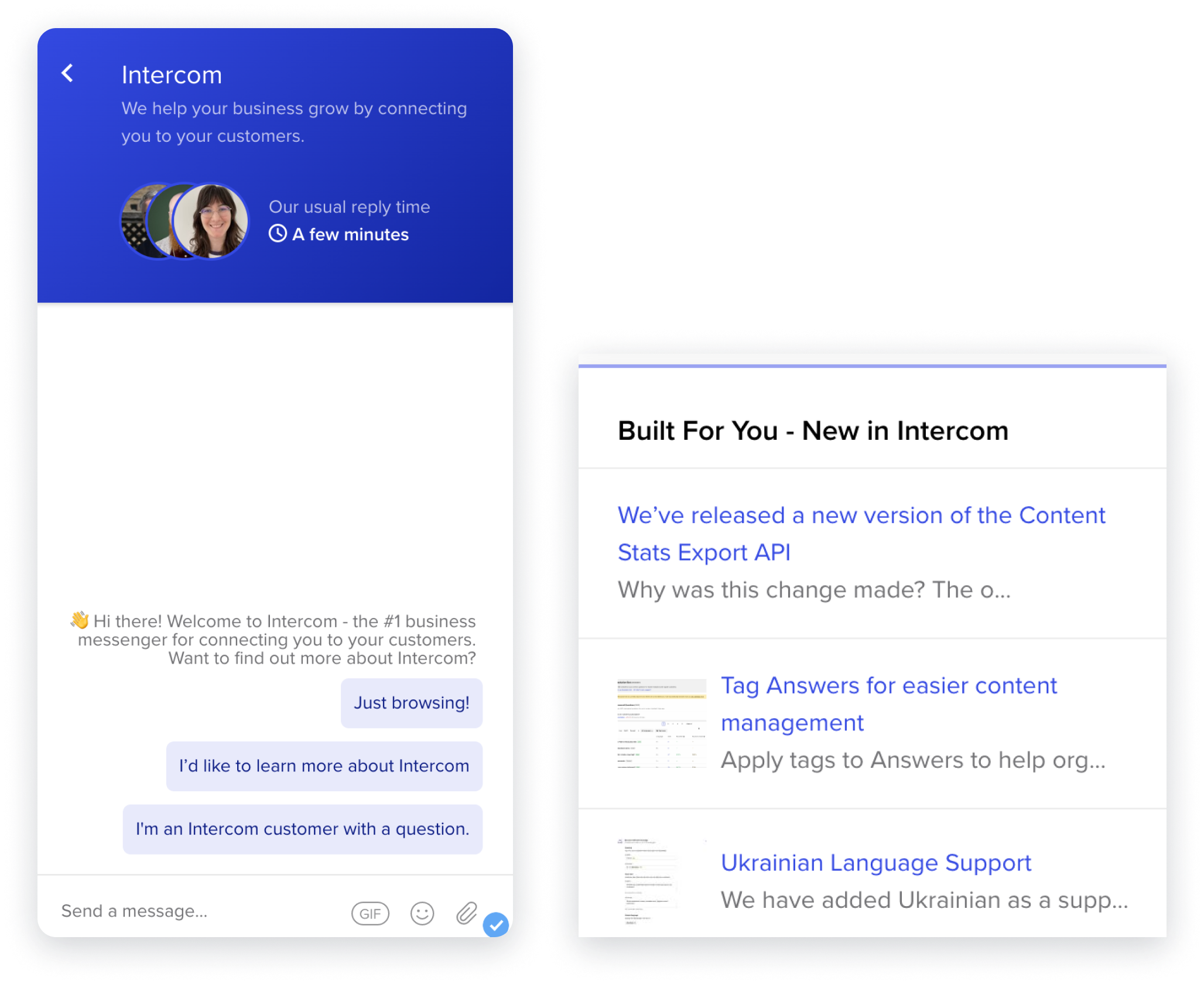
Customers rely on us to be proactive and anticipate their needs.
Intercom sets customers up for success by giving contextual links, relevant tool tips, and support on demand. Intercom is proactive and anticipates users needs. This makes customers feel validated, and that they can accomplish anything.

Once we wrapped our head around the research and insights, we invited designers to also get in the weeds with us.
We hosted weekly concept jams, and opened up our weekly crits to all designers. Our team hosted a concept jam where we had stakeholders and designers vote on their favorite iterations.
These were our highest rated concepts for our new design language refresh.


Because of the collaboration with other designers and teams, we narrowed down to one single direction to move forward with testing.
You know the drill. Back to testing we went.
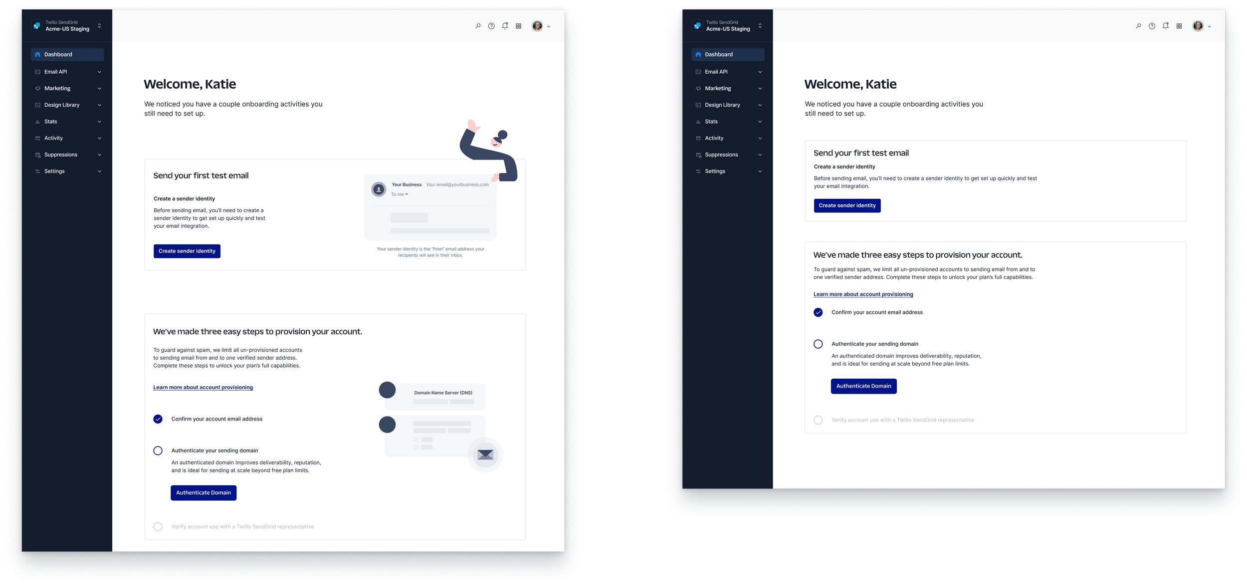
We tested the hero screens from our baseline survey with the hero screens in the new design language (shown below).


Then we wanted to turn up the dial on brand expression to see how those would score.
Type

Color

Illustration
What we got out of that research.
Baseline comparison – 59 participants
The new design direction should be used for our Twilio products
The design significantly increased our cohesion score while still feeling like Twilio.
Overall, the direction feels like Twilio
Brand expression – 51 participants
The final design direction should include more color and illustration (where applicable) in the content area of a product page to increase the perception of friendliness.
These modifications will maintain the professional feel and overall quality.
The use of Twilio Sans Display for headings and SF Pro did “score” higher (but not signficantly) but after evaluating the needs for the Twilio brand, we wanted to create a stronger alignment across all of our channels, and we believe fully diving in to our new Twilio Sans typeface will help us achieve this without too high of a risk.
The dark navigation + color variation is recommended because it was the design that participants preferred overall.
We took this as a win.

Let’s see the final product.
The outcome
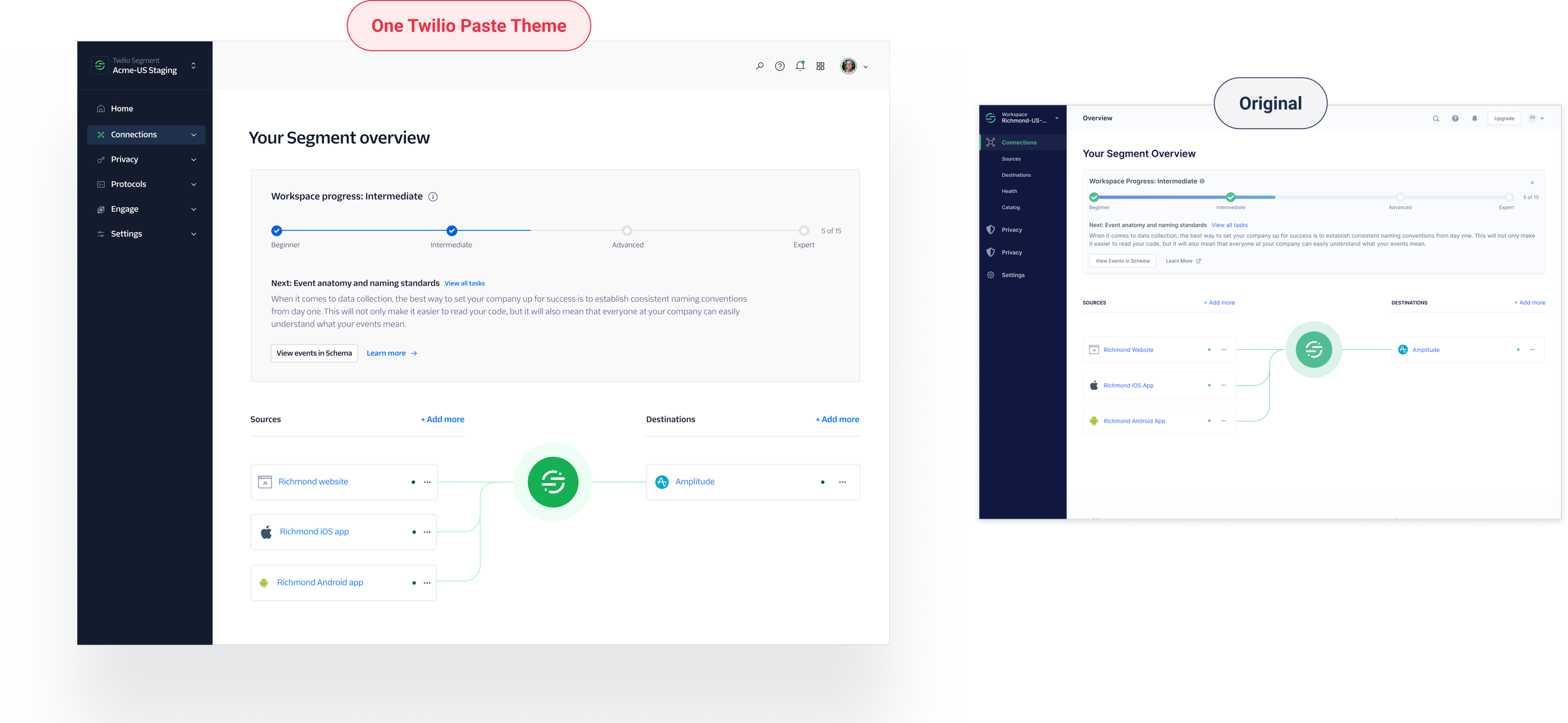
Segment’s refresh.
The outcome
Console’s refresh.

Implementation
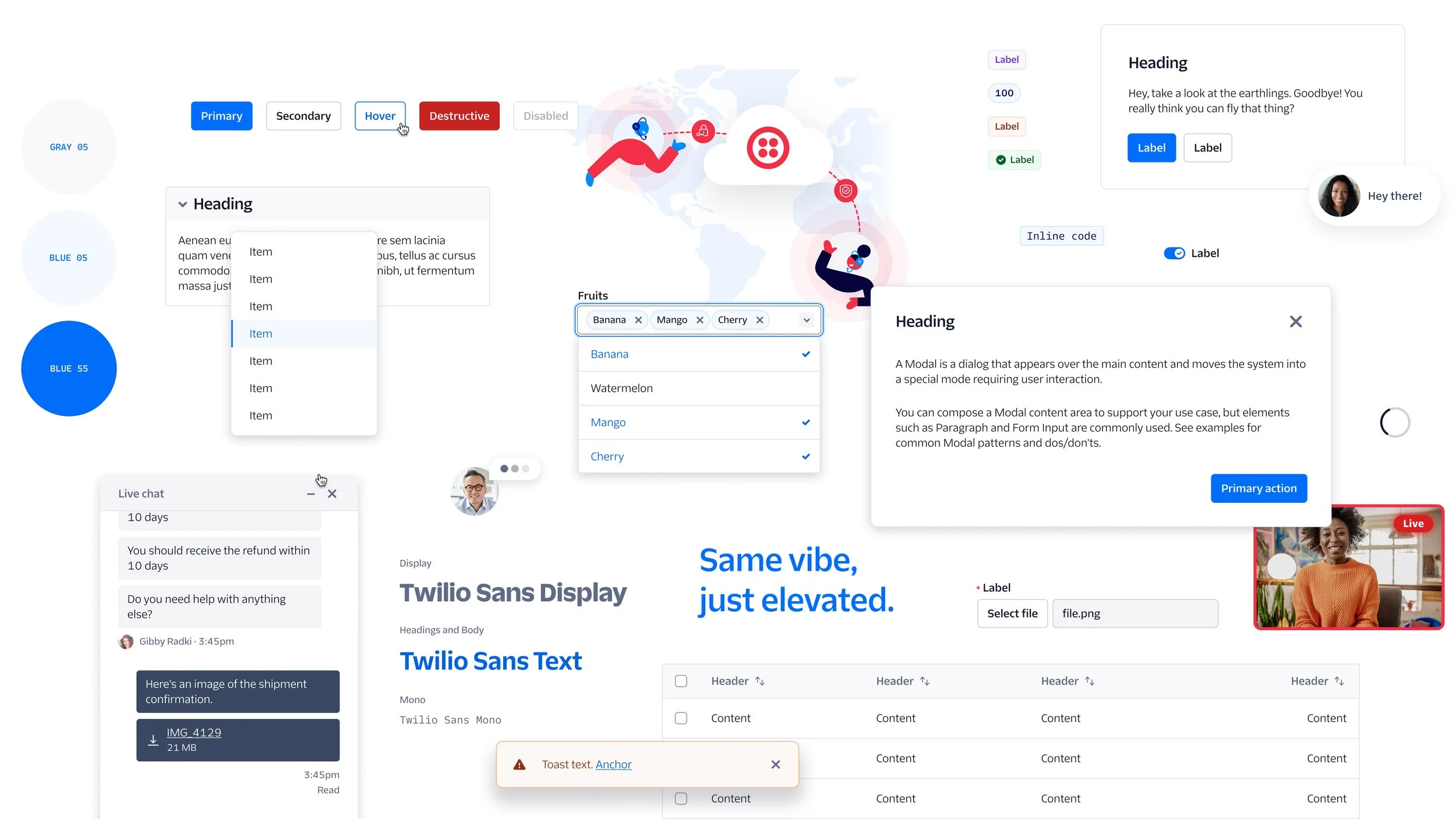
Where we landed with the paste Twilio theme.
We couldn’t forget about dark theme.
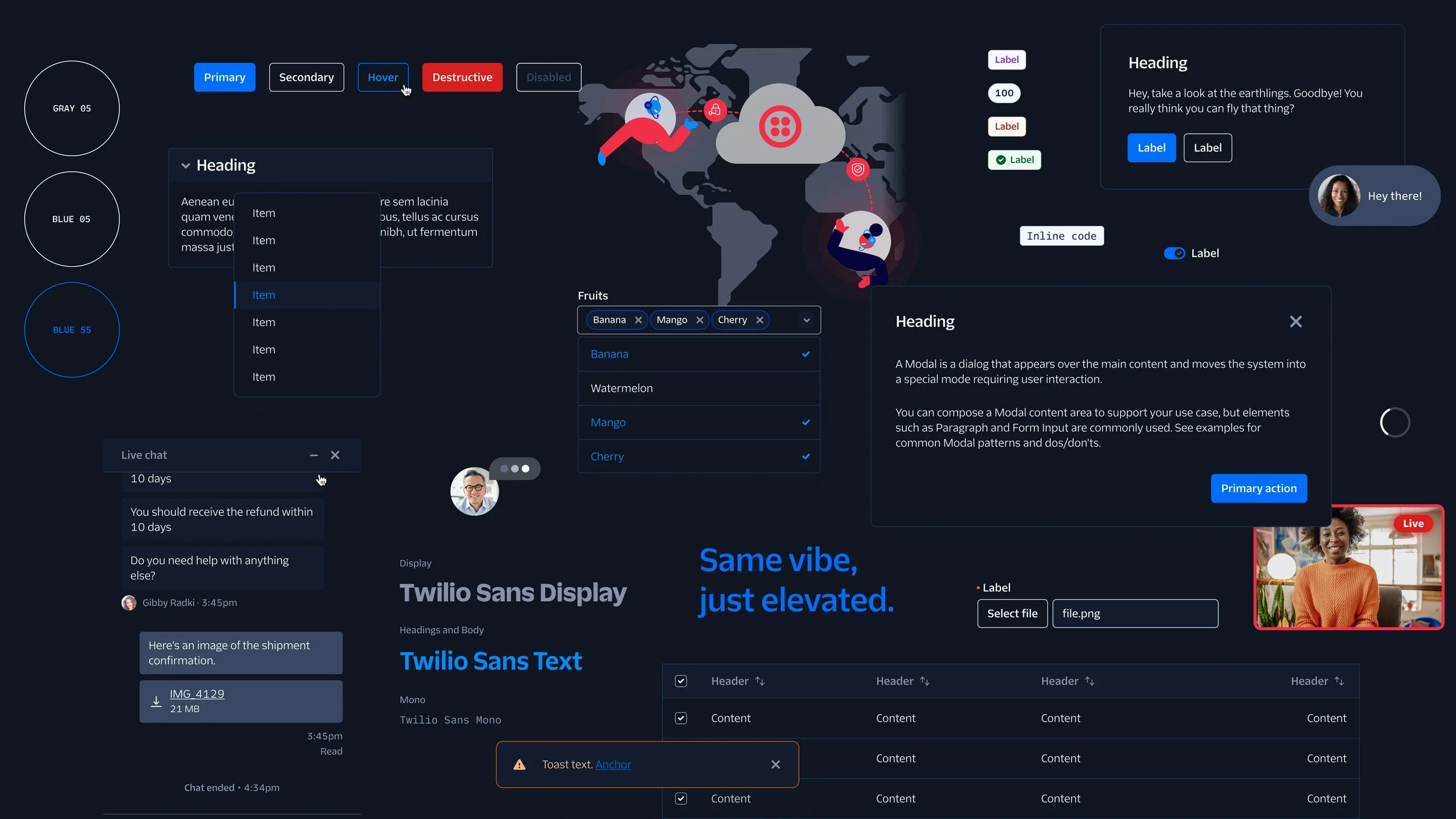

We set the foundation for the future.

A moment for reflection
From that first initial readout, we were able to maintain transparency and trust with the product teams by continuing to use that initial readout deck as our skeleton template. We continued to give updates on the product through share-out meetings and the monthly UX showcase. We also wanted designers to feel comfortable with the design language, so opened up our working sessions during Think Week, so outside designers could contribute their own design explorations. We also held three rounds of feedback for designers to give input and thoughts on the three narrowed-down directions of the new language.
Unfortunately, we had a lot of distractions on the project due to churn in our core team, leadership, and layoffs. Due to this distraction and timeline shifts,
I sometimes got overwhelmed by last-minute deviations from the plan. I like to be very well-prepared, so when things change rapidly I can get frazzled. I see this as an opportunity to not be so reactive to the first change, keep an eye on the overall goal, and evaluate the change. After taking a pause, I can then react by writing a few points on how to achieve the new scope.
One Twilio Team Member
“Multiple members of my team look up to her and see her as an example of the type of designer that they aspire to be more like… she regularly demonstrates her ability to ‘Be an Owner’, from leading through nebulous territory on the One Twilio project, to asking hard questions about how our brand illustrations are used or systemized.”
One Twilio Team Member
“Lib has also consistently demonstrated one of the most valuable things we look for in more senior ICs and that’s valuable relationship and influence building. Her work with the brand team has been invaluable to us this year and long may it continue in helping us bridge the gap between pre- and post-login Twilio experiences, across Twilio, SendGrid, and segment.”