Network Health Dashboard
Vision:
Our goal is to create a low-effort experience that anticipates customer issues where possible, solves the problem right the first time, and assures the problem stays solved over the long term.
Problem:
50% of AT&T Fiber customers experience a troubleshooting incident and our incremental churn is 4.3% higher for customers who experience issues.

Our root causes.
When issues arise, customers want an effortless, fast resolution. Unfortunately, 71% of our customers report a negative experience resolving their broadband issue. Their experience varies greatly on how they reach us and the technologies that serve them.

We addressed root causes across AT&T’s Broadband journey to understand customer pain points in order to create a North star for an ideal Broadband experience

We set out to create an experience blueprint.
-
The ideal vision for the customer experience, showing an aspirational North Star experience
-
Research: Data-driven insights to highlight our customer and their current pain pointsJourney: Narrative-driven showcase of the ideal state and key moments within it, including prototypes and reference designs
-
Prioritization for the business

We launched a customer survey to explore why customers are left unsatisfied.
1.5 Million per month of broadband customers seek support
15% of customers say Broadband issues are the most important issue however, they don’t seek AT&T support
We needed to pinpoint customers values and behaviors.
From that synthesis, we created customer archetypes to represent customer values and how they manifest in behavior. We focused on the archetype named the Silent Sufferer for our ideal experience.

Our main archetype
“ I just hope it comes back on its own.”
— A Silent Sufferer
“ I experience these issues daily. But I don’t call in because it’s a waste of time.”
— A Silent Sufferer
We hosted a concept jam with our team and stakeholders.
120 Idea Seeds
9 themes
Features and feasibility by ranking


We needed to visualize those big rocks (ideas).
From our concept jam, we identified appropriate in-flight initiatives and synthesized those with the best concepts. We used top features from ranking, and created storyboards to quickly articulate the features and concepts we wanted to illustrate.
From there, we validated our key concepts with our customers
Survey ~200 participants
Understand customers' perceived value of the concepts and features
Our participants saw 6 concepts as narrated animations
These testing results informed our next round of higher-fidelity prototypes

We created a blueprint for our ideal Journey.
Mapped out each step a user takes and the key screens they'll interact with.
This helped inform us on what key screens we wanted to prototype.
Defined content and functionality on all key screens
Interactive & detailed screens to test concepts with customers.

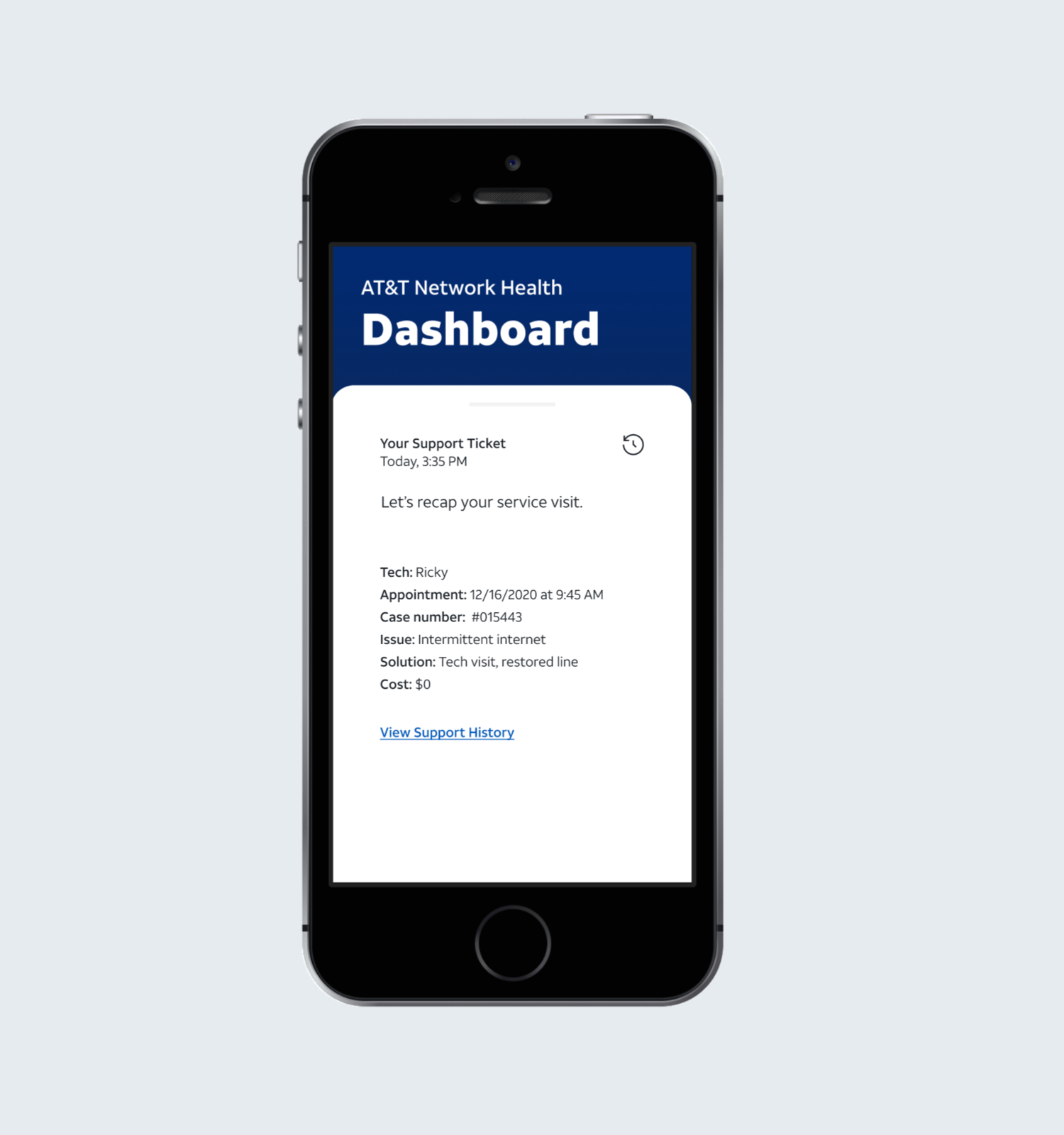
The Network Health Dashboard is a contextual, dynamic view of a customer’s network, tracking performance and data to proactively solve issues.
Story:
Jacqueline is experiencing intermittent internet issues. Through her Home Network Dashboard, she can monitor performance, pinpoint which parts of her home network are having issues, troubleshoot and schedule a technician.
Value:
Aim to unburden customers from reaching out first when there's an issue, share diagnostics, and preserve the diagnostic history
(looks to resolve Root Cause 01 & 02 04)
The Network Health Dashboard breaks down a customer’s network into components to provide performance status and data at a glance.

Network components, in order of operation:
01
Line Stability:
Shows service going into the house, if there are any disruptions in serviceTest: Quality check
02
Gateway Performance:
Shows if the gateway is online and receiving the minimum speed for the planTest: Speed test
03
Device Connectivity:
Shows which devices are connected, the coverage each receives, and the bandwidth they are using Test: Quality check